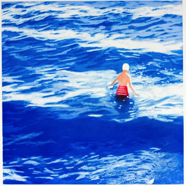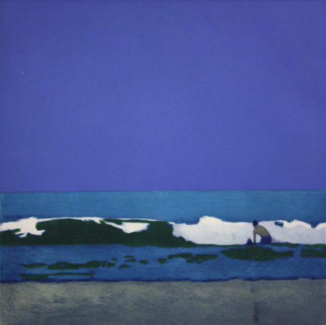
Man In The Waves
2009
Direct to plate
photogravure and aquatint
Somerset velvet white paper
Image size 20½” x 20½”
Paper size 31½” x 30½”
Edition of 50
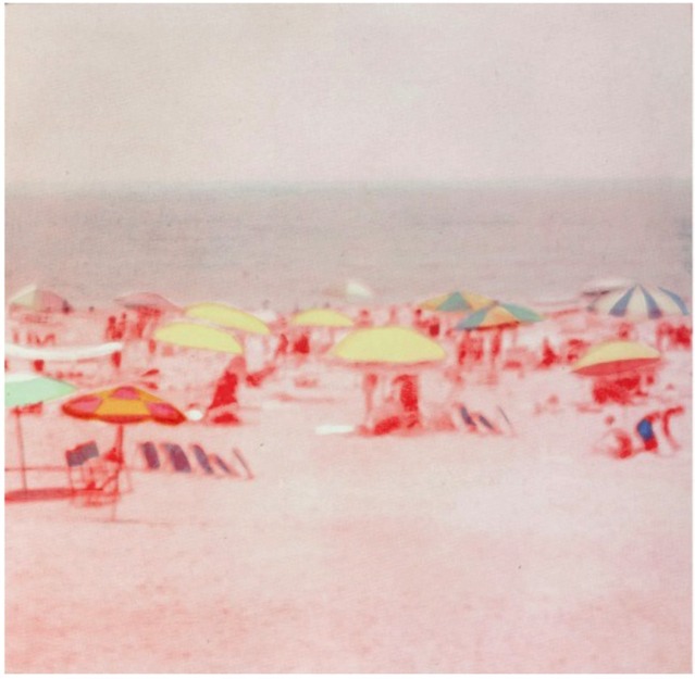
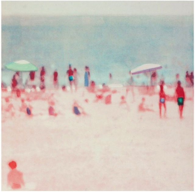
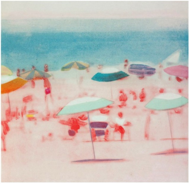
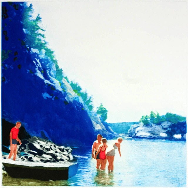
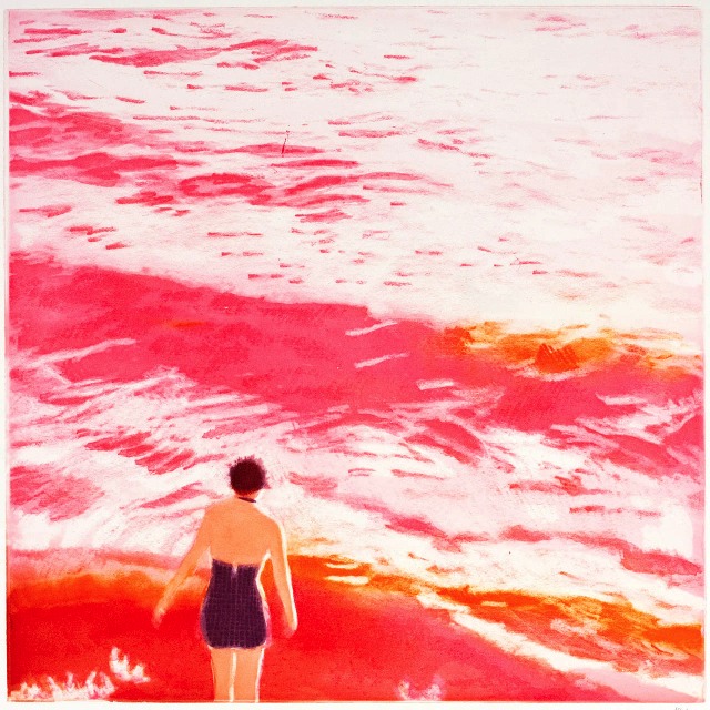
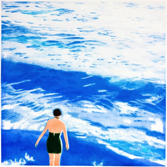
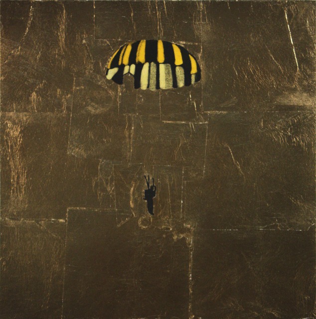
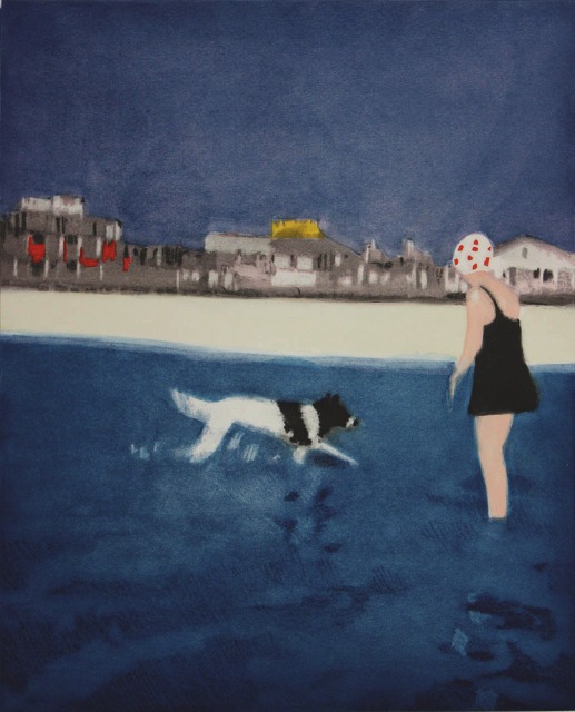
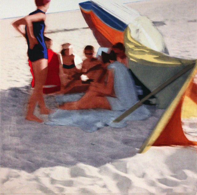
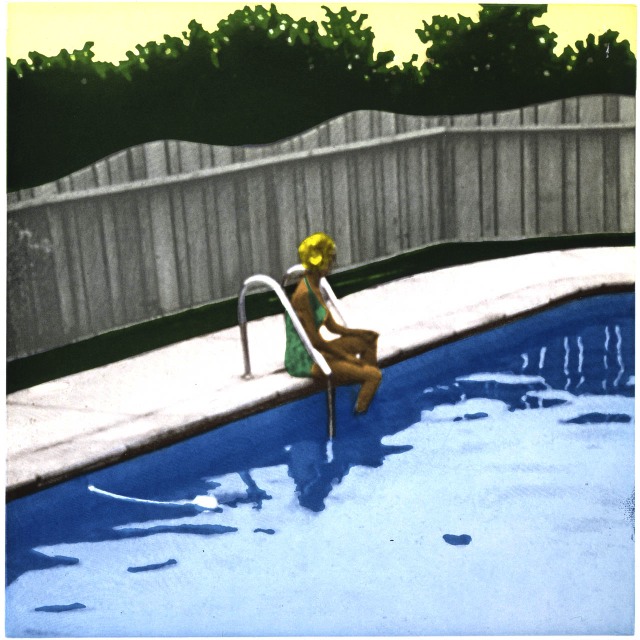
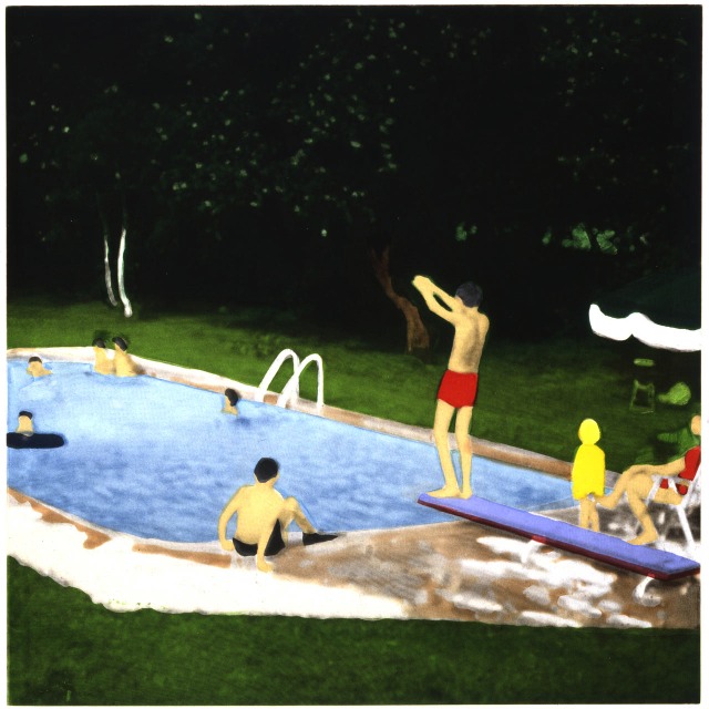
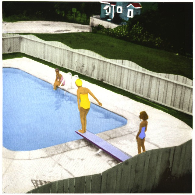
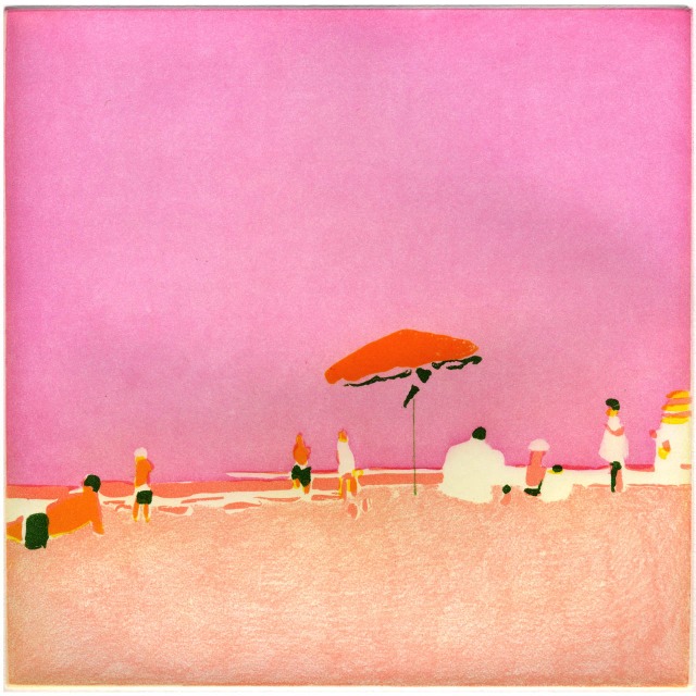
Isca Greenfield-Sanders makes images of refracted light and subjects just out of reach. She is not afraid of combining beauty with a sense of the ominous that may be just outside the viewer’s frame. Indeed, she celebrates the ambiguous. These long beach scenes and parachutists conjure up dreams of nearly forgotten family holidays and war heroes. Her images come from discarded family photographs and slides that she purchases secondhand. This 2008 group of prints also shares a sensibility with Japanese water colors. They were made with a new process developed by Paulson Press and Magnolia Editions called directto-plate
photogravure.
Q: Let’s talk about the new images. Where are they coming from?[read more=”Click here to Read More” less=”Read Less”]
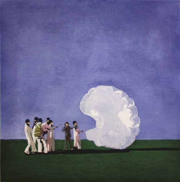
A: eBay. I bought a Korean War parachute, which I had in the studio while I was painting. I wanted to see the faded color. I liked the meeting of conceptual and physical fragility. This thing, held together by kitchen cord, saves people’s lives.
Q: Tell me about the appeal of the parachutes and the beach settings.
A: Both the beaches and the parachutes focus on small figures awash in an encompassing landscape. The largess of water has always been impressive to me. With the parachutes, I was taken by the idea that a vintage object could symbolize an escape. I say vintage because
we hardly use parachutes anymore, we just don’t fight those kind of wars. The notion of safe surrender is something I was excited by.
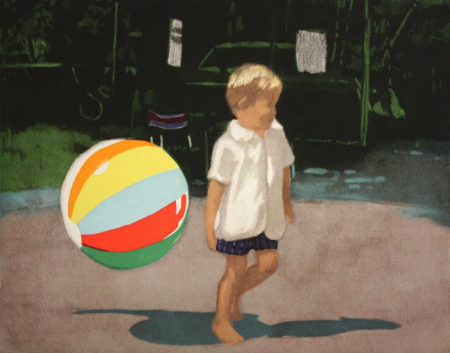
Q: What about the image of the boy? He seems to be walking away.
A: All my paintings of children have a sense of isolation and a little bit of darkness. “Tommy and the Ball” is a good
example of that. That size of that ball next to that little kid is something I enjoyed.
Q: You named him?
A: Oh, no. The slides were labeled. Some archives are lovingly notated. Tommy is really Tommy.
Q: How has your work changed recently?
Q: Tell me about how you title your works.
A: Each painting is titled descriptively, but with as much poetic ambiguity as possible. The parachutes paintings were collectively titled “Against the Fall” which is the literal translation of the French word parachute.
Q: Can you think of a phrase that captures your process?
A: I use the term “archeological quest” sometimes. I am interested in the couple of decades before I was born. I look through my archives quickly until I find something I can mine for emotional content. I think of it as the accidental capture.
A: The early paintings had more of a watercolor quality – almost stained rather than actively painted. Thin layers of transparent glazes. Over time, I became more interested in combining thin glazes with heavier paint in the same composition. That is hard to translate to printing. We had to break apart how I had built the images and translate that into ink. You can do anything with ink. I know what works in paint, and Renee and Pam help translate that into what will work with ink. When I work with an image, I make a
number of watercolor studies. I will make up to three different versions in different sizes. By the time I am through with an image, I may have painted it 15 times.
Q: You used a new technology for this project?
A: With my paintings, I start by making a watercolor study. For this project I sent my watercolor studies to Renee ahead of time. She enlarged the studies electronically and then printed them directly onto a copper plate. That plate is called the key plate. When I got to California, we started building them out as color etchings. This new process is just like my paintings in that way, we built the color right on top of the image. You can’t fudge in printmaking the way you can in painting; it is so precise.
Q: Tell me about the print entitled“Golden Parachute?” It feels different than the rest.
A: That etching is part aquatint and part applied gold leaf. When I arrived in Berkeley to make the etchings, we added this print to the set. I just couldn’t ignore it’s pertinence for our times.
Q: Are there any prints that are radically different than the paintings?
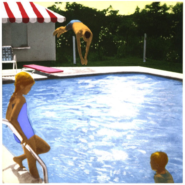
A: “Man in the Waves” is unlike any one study or painting I have made of that image. But it is a perfect meshing of the best of the studies. I am happier with that print than any of the watercolor studies I made with that piece. It translates so perfectly to etching.
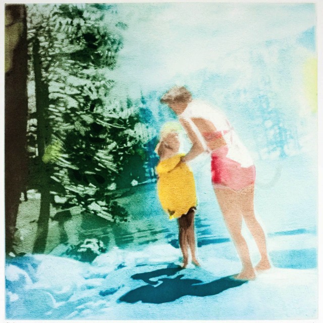
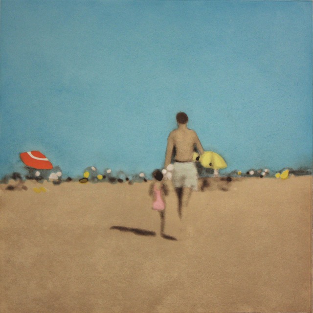
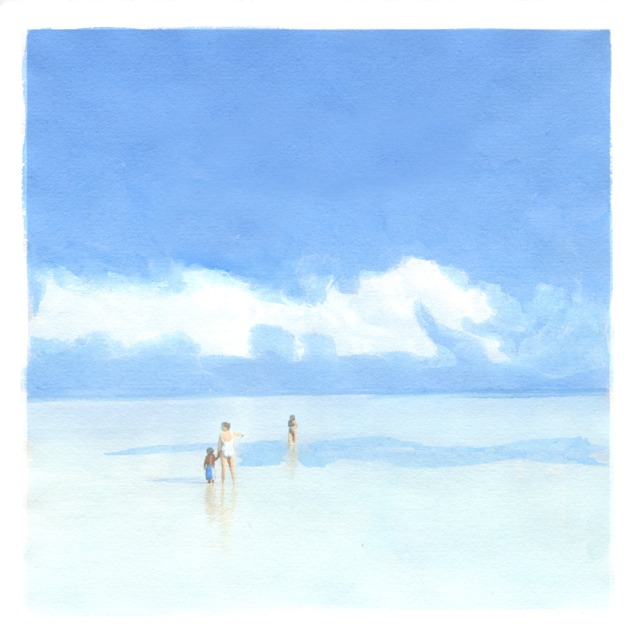
Q: What about “Walk with Daddy?” That one feels so much like an image of lost innocence.
A: Hundreds of people have contacted me about that image. In studio visits, people are in tears when they see it. I don’t think all artists would like that, but I love it. Remember, I am working from 35mm slides, these two figures, which were in the background of the photograph, are smaller than the head of a pin. All the information about them is missing, so I have to make it up in paint and color.[/read]